Fenwick
An expense-approval tool for a 200-person scale-up, designed for managers who approve requests several times a day.
- Role
- Product designer and prototype build, solo
- Company
- Fenwick (fictional) · Stockholm, London, Berlin
- Timeline
- Aug 2026
- Platform
- Internal web app, light and dark mode
- Stack
- Figma · React · Claude Code · Vercel
- Status
- Live prototype ↗
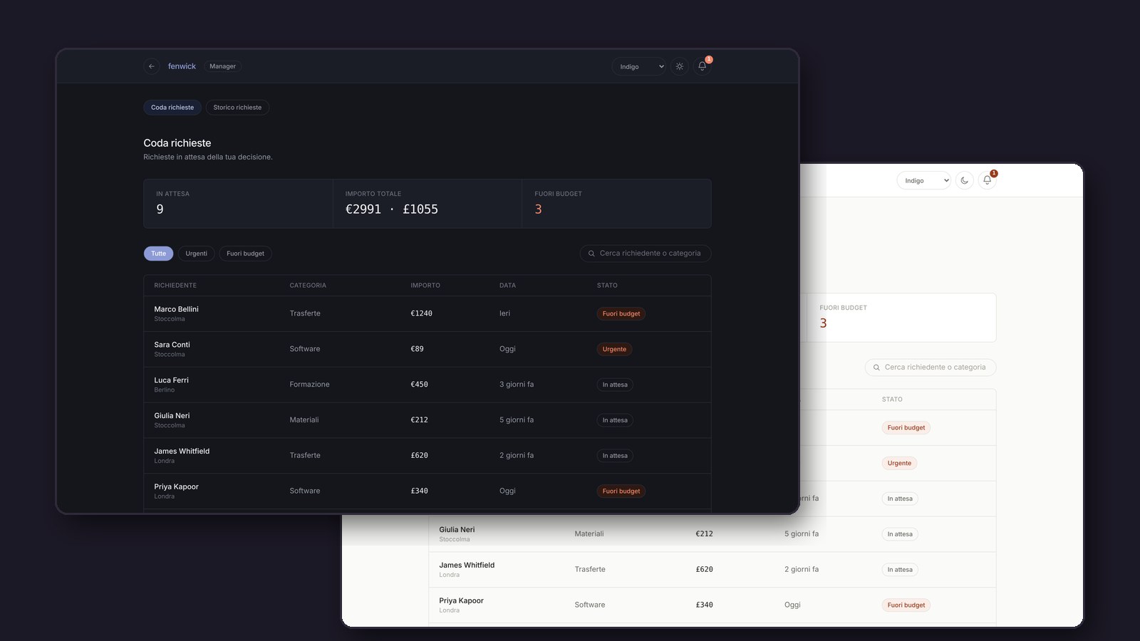
Approvals took 4 days on average, and 15% of requests got lost in Slack threads.
The problem
Fenwick grew from 60 to 200 people in 18 months, with teams in Stockholm, London and Berlin. Expense approvals still worked the way they did at 60 people: requests on Slack, shared spreadsheets, approvals by email.
- Managers only saw their team's remaining budget in finance's monthly report, often after it was already spent.
- At the end of a quarter, a manager could have 50 or more requests waiting.
- A suite like SAP Concur would take months to set up and an IT team Fenwick doesn't have.
Key decisions
Show the budget next to the request
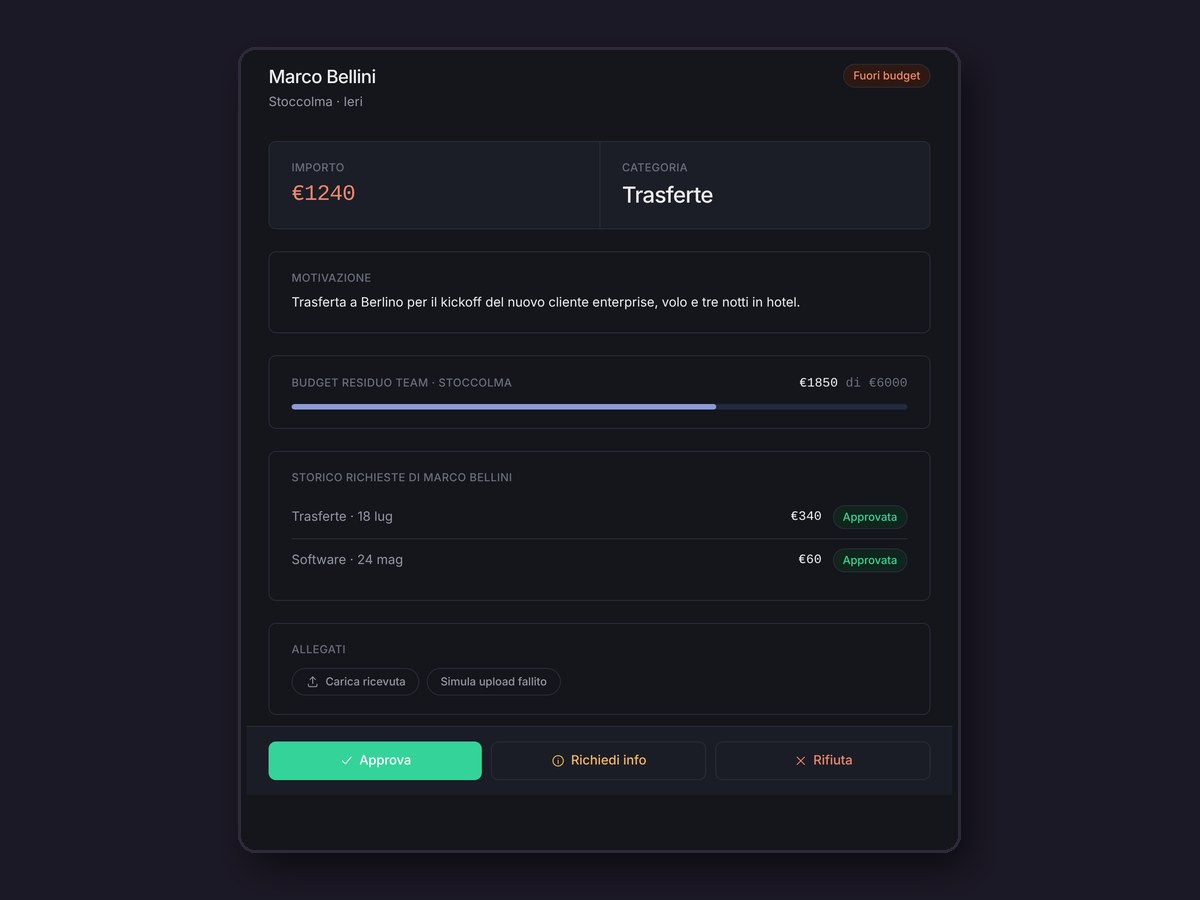
A manager who sees "€212" on its own decides differently from one who sees "€212, and the team is already at 69% of its monthly budget". The request detail shows the team's remaining budget with a progress bar, plus the requester's history, so the decision happens in one place.
Why: it turns a mechanical approval into an informed decision, without opening another tool.
Three actions, always visible
Approve, Request info and Reject are three fixed buttons, not a dropdown. "Request info" doesn't create a new screen: the request goes back into the same queue with a badge. Over-budget approvals don't close immediately; they move to a separate Finance queue for the final yes or no, and both the employee and the manager hear the outcome.
Why: for someone doing this five times a day, every hidden click adds up.
Work with Slack, not against it
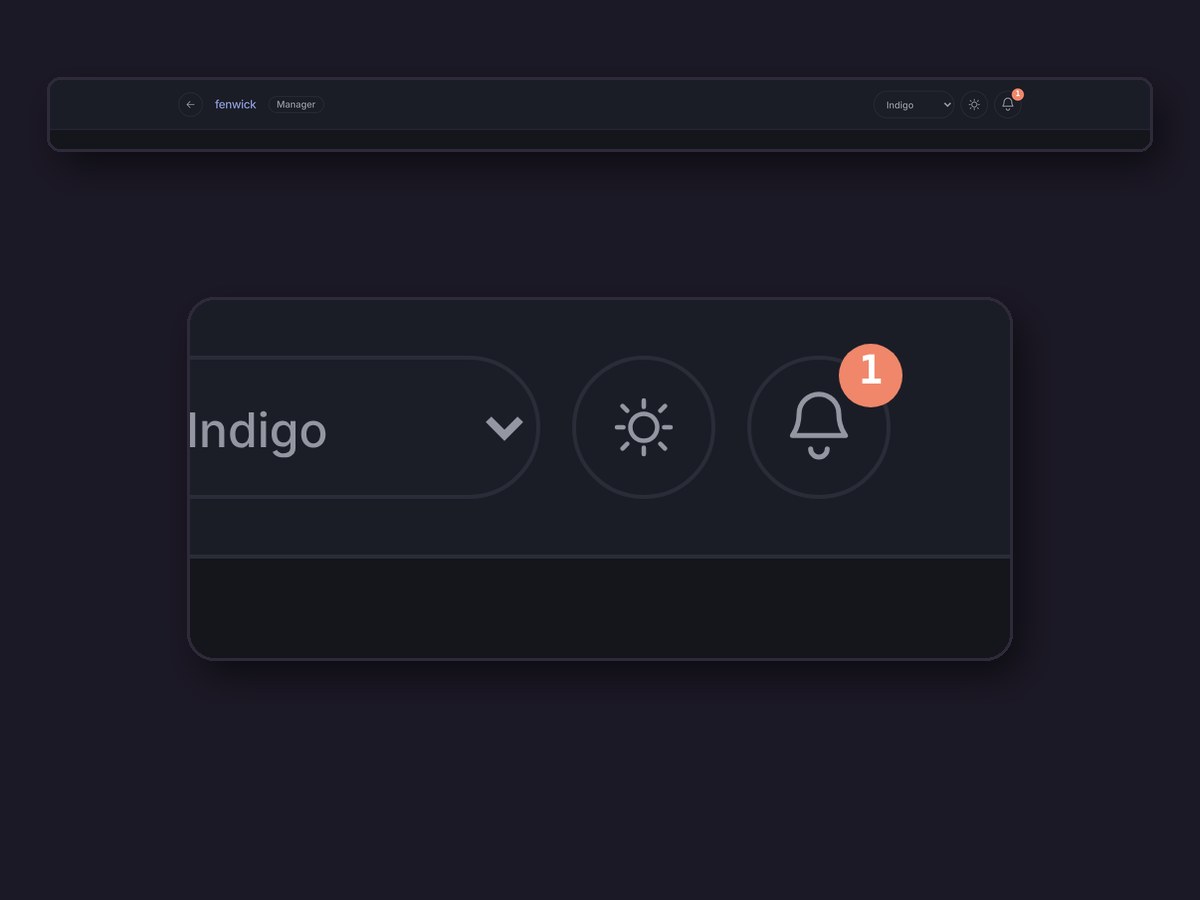
I ruled out two options: no indicator at all, and a full notification centre. The first risked missed updates for managers who open the tool rarely. The second would have turned Fenwick into a second Slack. A bell with a counter says "something changed" and nothing more.
Why: notifications stay where the team already talks; the action happens in the tool.
Built for a queue of 50, not for one request
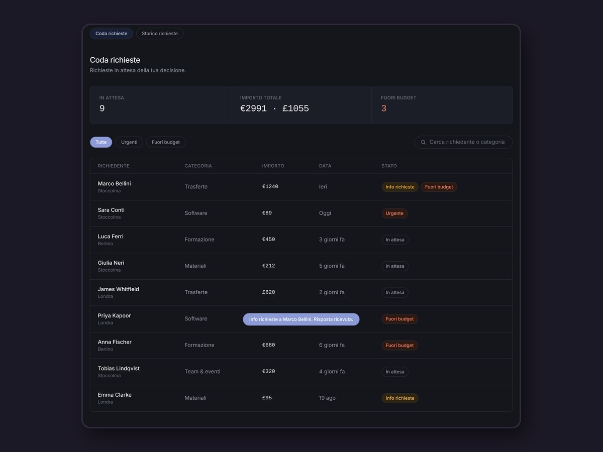
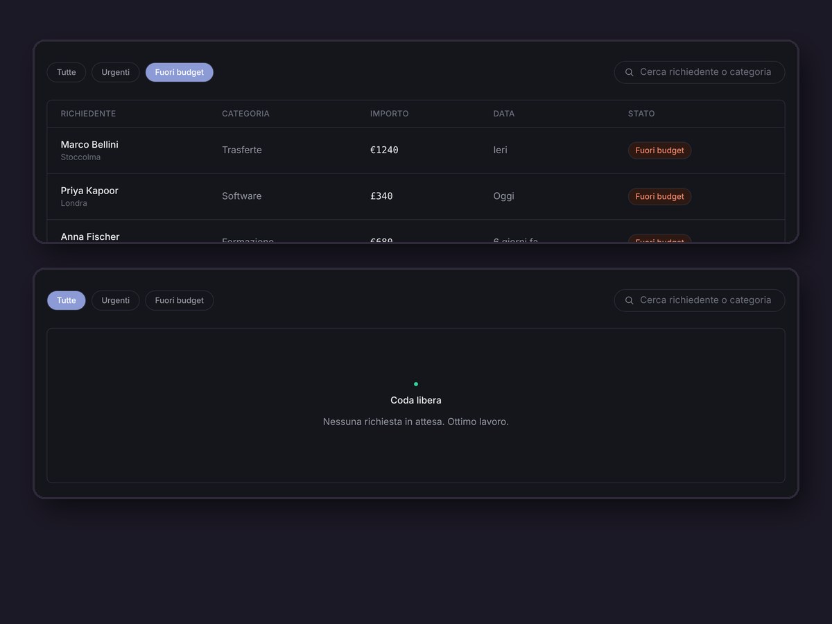
Three summary numbers at the top (waiting, total amount, over budget), then a table instead of cards, so amounts compare at a glance. "Urgent" and "Over budget" are always-visible filters, because they're what a manager checks first. The copy does its part too: an empty queue says "Queue clear", errors say exactly what went wrong, and dates are relative only within the last week.
Why: a power user needs speed on the hundredth visit, not guidance on the first.
Results
A concept: targets, not measurements
What I'd do next
The limit I'd fix first: the budget bar assumes the accounting system updates in real time. In a real company that takes weeks of work with engineering. Next time I'd ask the data team how realistic that number is before designing a whole screen around it.
- The employee side: submitting a request, which is still static.
- Reporting for the finance team, beyond the request history.
- A second approval level for very large amounts.