NoLimits
From WhatsApp threads and spreadsheets to one app that athletes and coaches use every day.
- Role
- Product designer and builder, solo
- Client
- NoLimits Coaching, Italy · 2 coaches
- Timeline
- Apr 2026 – present
- Platform
- Installable mobile app (PWA) + coach dashboard, web and mobile
- Stack
- Figma · React · Tailwind · Supabase (EU) · Cloudflare · Claude Code
- Status
- Live test, 11–25 Nov 2026 · 2 coaches, 5 athletes
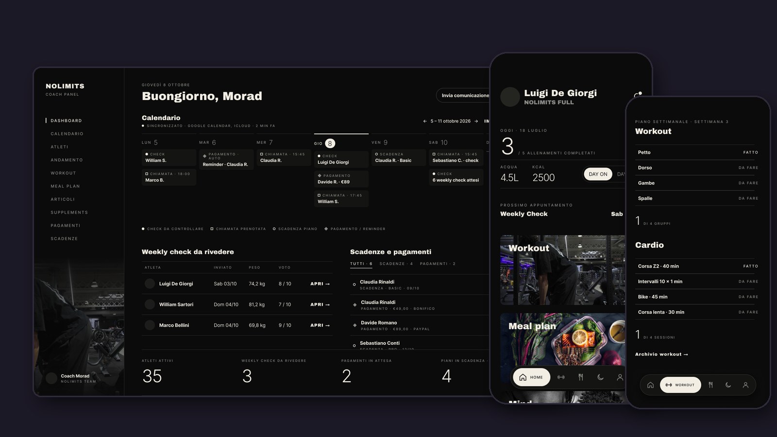
Design review closed on 22 October. All seven test flows live by 27 October.
The problem
NoLimits is an online coaching service for training, nutrition and mental wellbeing. Like most coaching businesses, it ran on WhatsApp and Instagram, with training plans in Excel. I'm one of their athletes, so I felt the gaps first-hand before I designed anything.
- Plans got buried in chat threads, and old plans were impossible to find again.
- Progress lived nowhere consistent: photos in one chat, weights in another.
- There was no single place that felt like it was actually made for the athlete.
Key decisions
I rejected my own redesign
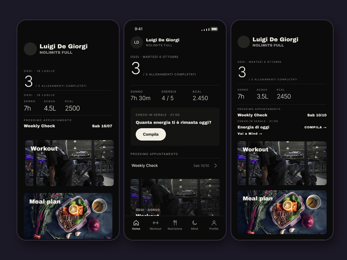
My first pass rebuilt the design system from scratch: new type scale, new components. It was cleaner, but it no longer looked like NoLimits. I kept it as an archive, rebuilt the screens with the client's original components, and put Original, v2 and v3 side by side to choose the best version of each screen.
Why: a coaching brand lives on trust. The app had to feel like the coaches' own, not like my portfolio piece.
WhatsApp stays, the app takes the structure
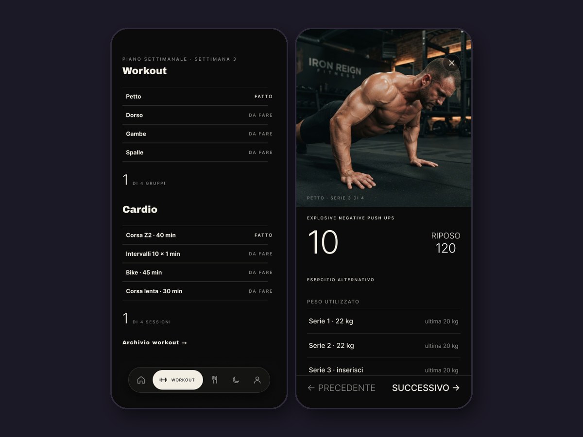
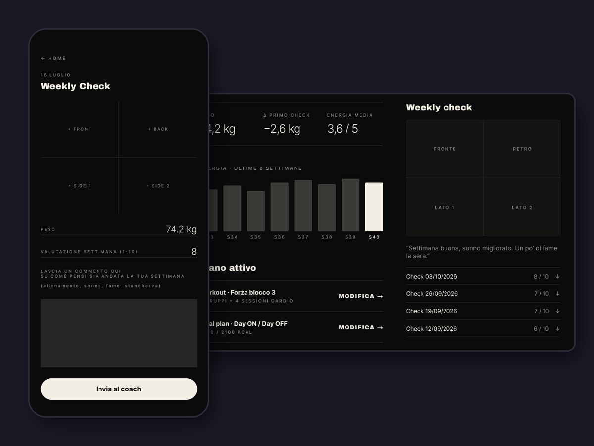
I didn't try to replace the chat. The community and the quick messages already worked on WhatsApp, so "Contact your coach" simply opens it. The app holds what WhatsApp was never built for: plans, loads per set, weekly check-ins, progress and payments.
Why: asking people to move their whole relationship into a new app is the fastest way to get it ignored.
A coach panel built to save time
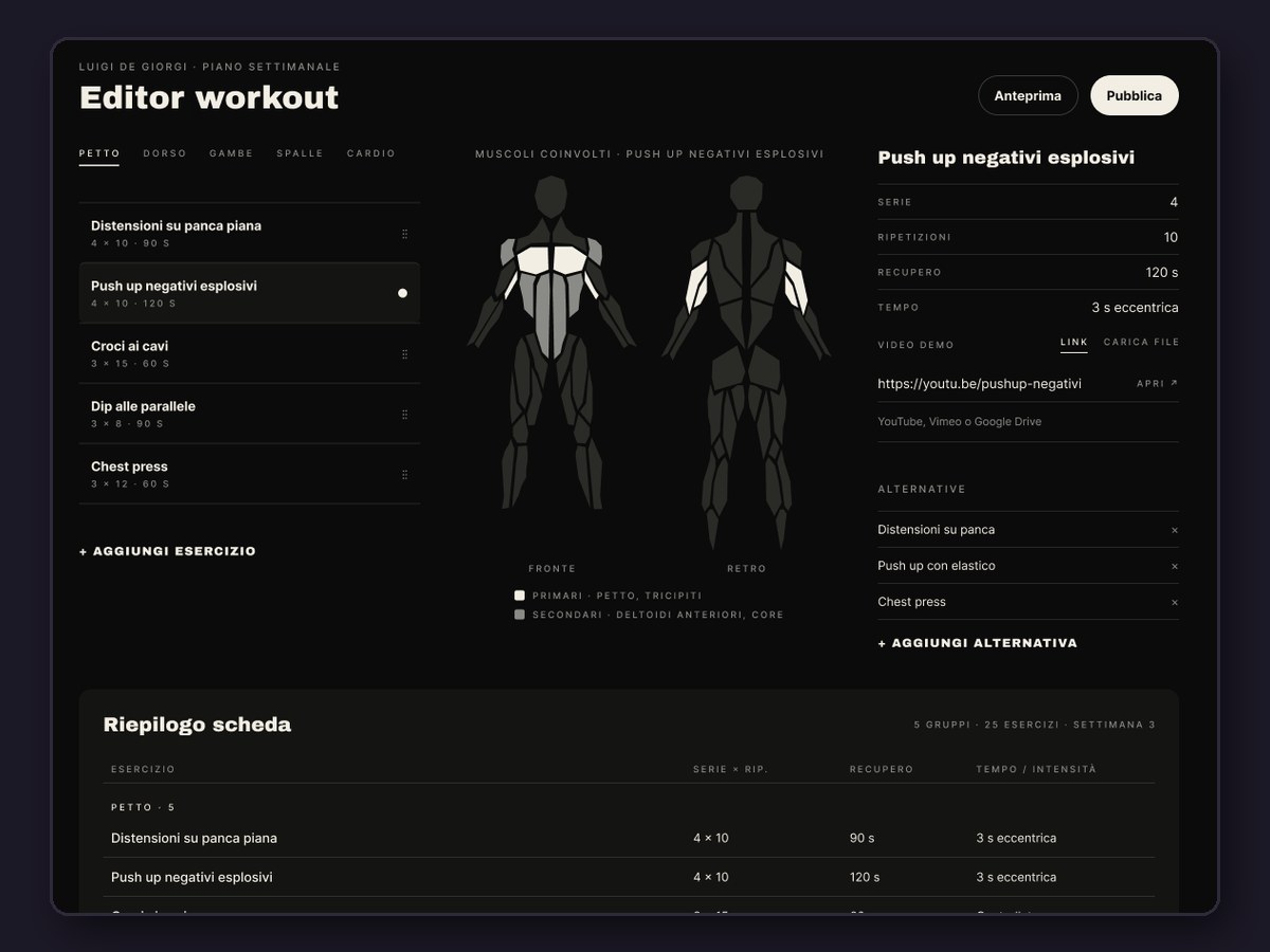
The coach side got the same care as the athlete app. The workout editor uses the coaches' own catalogue of 51 exercises and lights up the target muscles on a body map. Meal plans total their macros automatically. Payment reminders go out on their own 7 and 3 days before the due date, on the day, and 3 days after.
Why: if the coaches don't save time, the athletes never get the app.
Cut the scope to test sooner
For the first test I left out the plan tiers, the Mind module, supplements and the calendar, and kept the meal plan to macros only. What stayed is the weekly loop: plan, train, check in, get feedback, pay. Energy check-ins count as health data, so the data is hosted in the EU, athletes give consent when they activate their account, and each athlete can only see their own records.
Why: two weeks with seven real users teach more than another month in Figma.
Results
Test results arrive on 25 Nov 2026
What I'd do next
- Bring back what the test left out, in the order the coaches ask for it: Mind, supplements, plan tiers, calendar.
- Fix the accessibility gaps I documented in the original design system: 9–10 px labels and tap targets under 44 pt.
- A view that compares progress across all athletes at once, not one profile at a time.
- An English version, so the coaches can take on clients outside Italy.